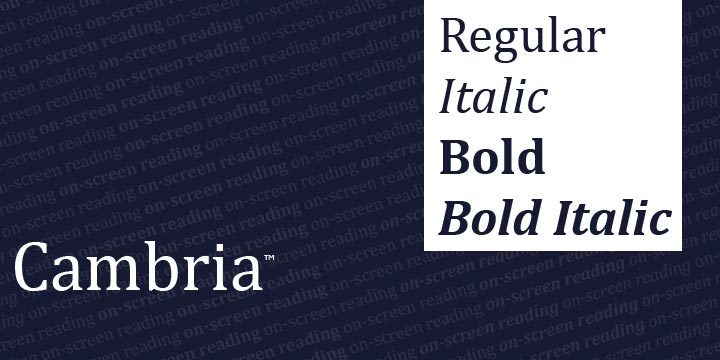
Cambria Bold fuente
Licencia: Pagado
Idiomas:
cirílico, latino
Información de fuentes
Hemos recopilado toda la información más importante sobre la fuente Cambria Bold. A continuación se muestra una tabla sobre la versión del archivo de fuente, la licencia, los derechos de autor, el diseñador y el nombre del proveedor. La información se toma del archivo de fuente "TTF".
| Nombre de la familia de fuentes | Cambria |
| Nombre de la fuente | Cambria Bold |
| nombre del estilo | Bold |
| Identificador de fuente | Microsoft: Cambria Bold: 2004 |
| Versión de fuente | Version 0.90 |
| Marca comercial | Cambria is either a registered trademark or a trademark of Microsoft Corporation in the United States and/or other countries. |
| Diseñador | Agfa Monotype Corporation |
| Enlace de diseñador | http://www.fonts.com |
| Enlace al vendedor (proveedor) | http://www.microsoft.com/typography/ctfonts |
| Fabricante | Microsoft Corporation |
| Enlace a la licencia | http://www.microsoft.com/typography/fonts/default.aspx |
| Licencia | This font software is part of the Microsoft software product in which it was included and is provided under the end user license agreement (ÒEULAÓ) for that Microsoft software product. The terms and conditions of the EULA govern the use of font software. Please refer to the applicable Microsoft product EULA if you have any questions about how you may use this font software. Microsoft reserves all rights that are not expressly granted in the EULA. For products that may have installed this font please see the link below. |
| Derechos de autor | © 2004 Microsoft Corporation. All Rights Reserved. |
| Descripción | The Cambria has been designed for on-screen reading and to look good when printed at small sizes. It has very even spacing and proportions. Diagonal and vertical hairlines and serifs are relatively strong, while horizontal serifs are small and intend to emphasize stroke endings rather than stand out themselves. This principle is most noticeable in the italics where the lowercase characters are subdued in style to be at their best as elements of word-images. When Cambria is used for captions at sizes over 20 point, the inter-character spacing should be slightly reduced for best results. The design isn't just intended for business documents: The regular weight has been extended with a large set of math and science symbols. The Greek and Cyrillic has been designed under close supervision of an international team of experts, who aimed to set a historical new standard in multi-script type design. |

Comentarios