Frutiger Pro Condensed LT Std Cn fuente
Licencia: Pagado
Autor: Linotype
Idiomas:
latín


Información de fuentes
Hemos recopilado toda la información más importante sobre la fuente Frutiger Pro Condensed LT Std Cn. A continuación se muestra una tabla sobre la versión del archivo de fuente, la licencia, los derechos de autor, el diseñador y el nombre del proveedor. La información se toma del archivo de fuente "TTF".
| Nombre de la familia de fuentes | Frutiger Std 57 Condensed |
| Nombre de la fuente | Frutiger Std 57 Condensed |
| nombre del estilo | 57 Condensed |
| Identificador de fuente | com.myfonts.easy.linotype.frutiger.57-condensed.wfkit2.version.53GQ |
| Versión de fuente | 2.000 Build 1000 |
| Marca comercial | Frutiger is a trademark of Monotype Imaging Inc. registered in the U.S. Patent and Trademark Office and may be registered in certain other jurisdictions. |
| Diseñador | Adrian Frutiger |
| Enlace de diseñador | http://www.monotype.com |
| Enlace al vendedor (proveedor) | http://www.monotype.com |
| Fabricante | Monotype Imaging Inc. |
| Derechos de autor | Copyright © 2014 Monotype Imaging Inc. All rights reserved. |
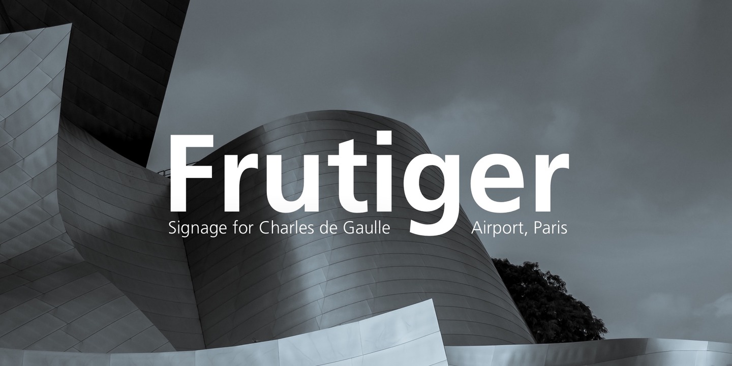
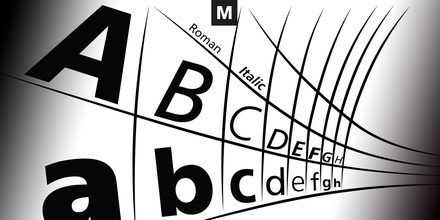
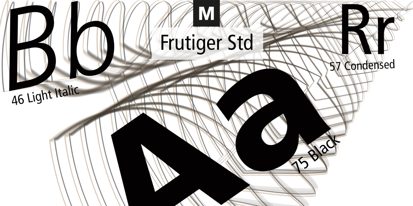
| Descripción | In 1968, Adrian Frutiger was commissioned to develop a sign and directional system for the new Charles de Gaulle Airport in Paris. Though everyone thought he would want to use his successful Univers font family, Frutiger decided instead to make a new sans serif typeface that would be suitable for the specific legibility requirements of airport signage: easy recognition from the distances and angles of driving and walking. The resulting font was in accord with the modern architecture of the airport.In 1976, he expanded and completed the family for D. Stempel AG in conjunction with Linotype, and it was named Frutiger. The Frutiger family is neither strictly geometric nor humanistic in construction; its forms are designed so that each individual character is quickly and easily recognized. Such distinctness makes it good for signage and display work. Although it was originally intended for the large scale of an airport, the full family has a warmth and subtlety that have, in recent years, made it popular for the smaller scale of body text in magazines and booklets. |
fuentes similares
- Frutiger Pro Condensed LT Com Light Cn Ita
- Frutiger Pro Condensed LT Com Extra Blk Cn Ita
- Frutiger Pro Condensed LT Com Condensed Ita
- Frutiger Pro Condensed LT Com Bold Cn
- Frutiger Pro Condensed LT Com Bold Cn Ita
- Frutiger Pro Condensed LT Com Black Cn
- Frutiger Pro Condensed LT Com Black Cn Ita
- Frutiger Pro Condensed LT Pro Light Cn
- Frutiger Pro Condensed LT Pro Light Cn Ita
- Frutiger Pro Condensed LT Pro Condensed
- Frutiger Pro Condensed LT Pro Condensed Ita
- Frutiger Pro Condensed LT Pro Bold Cn
- Frutiger Pro Condensed LT Pro Bold Cn Ita
- Frutiger Pro Condensed LT Pro Black Cn
- Frutiger Pro Condensed LT Pro Black Cn Ita
- Frutiger Pro Condensed LT Pro Extra Black Cn
- Frutiger Pro Condensed LT Pro Extra Blk Cn Ita
- Frutiger Pro Condensed LT Std Light Cn
- Frutiger Pro Condensed LT Std Extra Black Cn


Comentarios